Information

Visual aids like tables and figures can help to make complex data more understandable. Consistency in labeling, units, and scales is crucial for effective communication (Tufte, 2001). In Table 14 and Table 15, there are two examples of qualitative and quantitative data analysis.
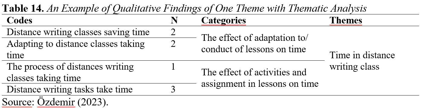
Table 14 explains how thematic analysis is performed and how qualitative data is organized, thus providing researchers with an understanding of how themes and categories are determined. It explains the qualitative findings obtained in the thematic analysis by showing the relationship between codes, categories and themes. For example, the code "Distance writing classes saving time" is divided into different categories that contribute to the theme "Time in distance writing class" and collected under this theme.

Tables could be used to list common obstacles and the percentage of respondents citing each obstacle. Figures might include graphs illustrating how different coping strategies correlate with publishing success.